Excel Tricks
This is so simple it's genius. I feel like a dork for never thinking of it. These are some lightweight way to create visuals like sparklines inside your Excel spreadsheet using really simple formulae. (This will be built-in in Office 12, but meanwhile, why wait?)
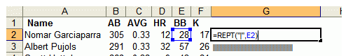
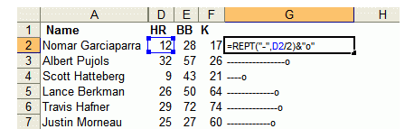
The bar graphs are built using the Excel REPT function which lets you repeat text a certain number of times. REPT looks like this:=REPT(text,number_of_times)
For instance, REPT(”X”,10) gives you “XXXXXXXXXX”. REPT can also repeat a phrase; REPT(”Oh my goodness! “,3) gives “Oh my goodness! Oh my goodness! Oh my goodness! ”
For in-cell bar charts, the trick is to repeat a single bar “|”. When formatted in 8 point Arial font, single bars look like bar graphs. Here’s the formula behind the bars:
As the guy notes, when you're doing data exploration, you don't want to struggle to figure out which values created which outliers. Big plots are nice for an overview, but you still have to do work to figure out which items generated which points. ("Data brushing" is the common technique in infovis circles for getting this kind of info, but it's work to implement.) Why not get at what you want right in the spreadsheet itself, so you're looking at the data and the visual right at the same time? He has a good example showing the value of this in action.
The followup responses to his original post got even better. Check out these tricks to do this kind of stuff:
Updated to add: Here's even more fun off Juice! Tufte-style charts in Excel, with a downloadable file to play with.
![]() Post Perma-Link |
Post Perma-Link |


0 Comments:
Post a Comment
<< Home